
Read the advice on this subject and you will find fewer form fields, a clear value proposition, customer logos, one call to action, load under three seconds.
Every one of those is correct. Every one of them is also what you would tell someone selling running shoes.
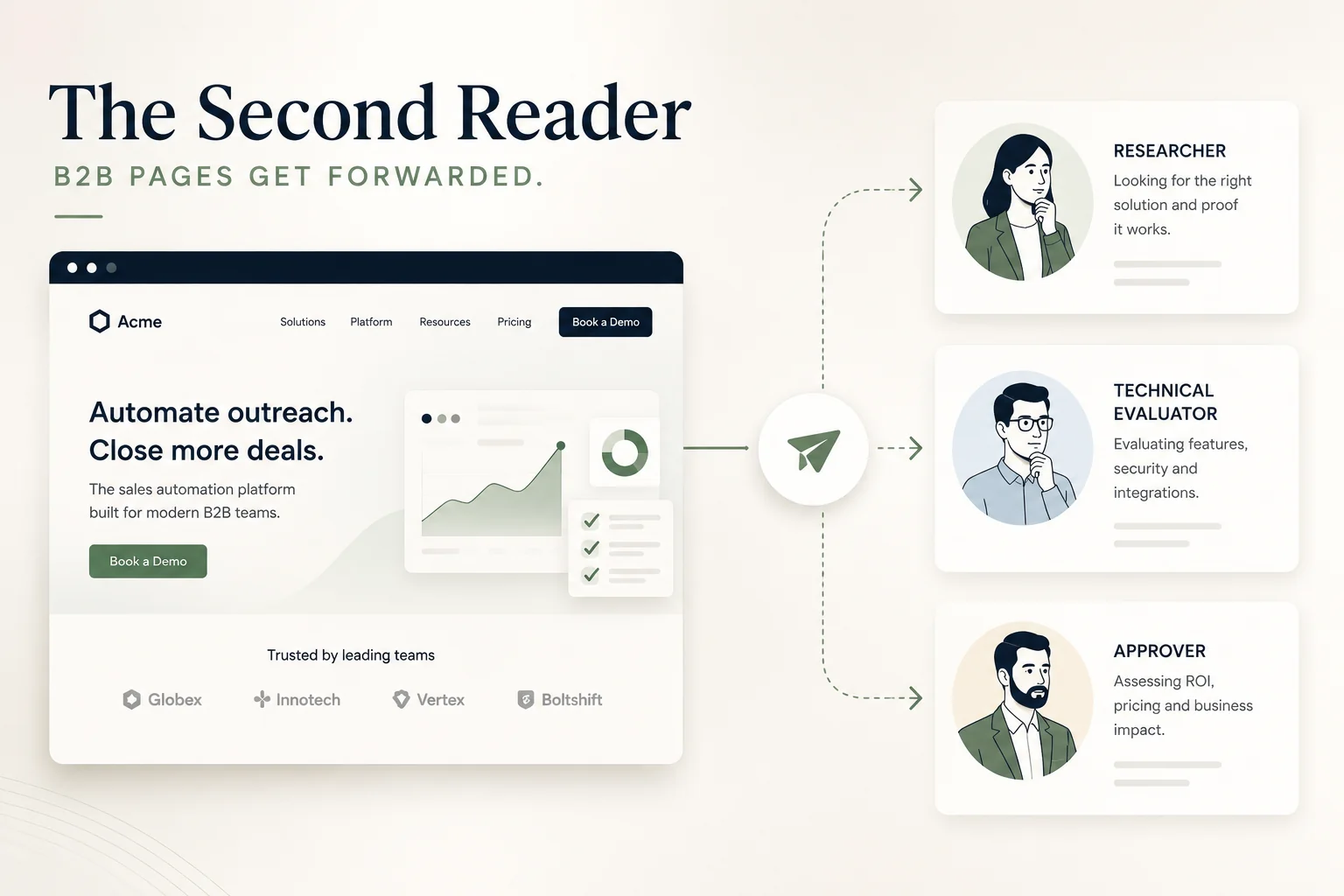
The thing that makes a B2B landing page different is not the copy. It is that somebody forwards it.
The short answer
A B2C landing page is read once, by the person who clicked the ad, in the moment they clicked it. A B2B landing page is read by that person and then by two or three colleagues who never saw the ad, arrive days later with no context, hold different jobs, and often outrank the person who found it. Most B2B pages are built for the first reader and fail the second — who is frequently the one deciding.
Key takeaways
- B2B pages get forwarded. Design for the reader who arrives with no context.
- Restate the ad’s promise on the page. The second reader never saw it and cannot infer it.
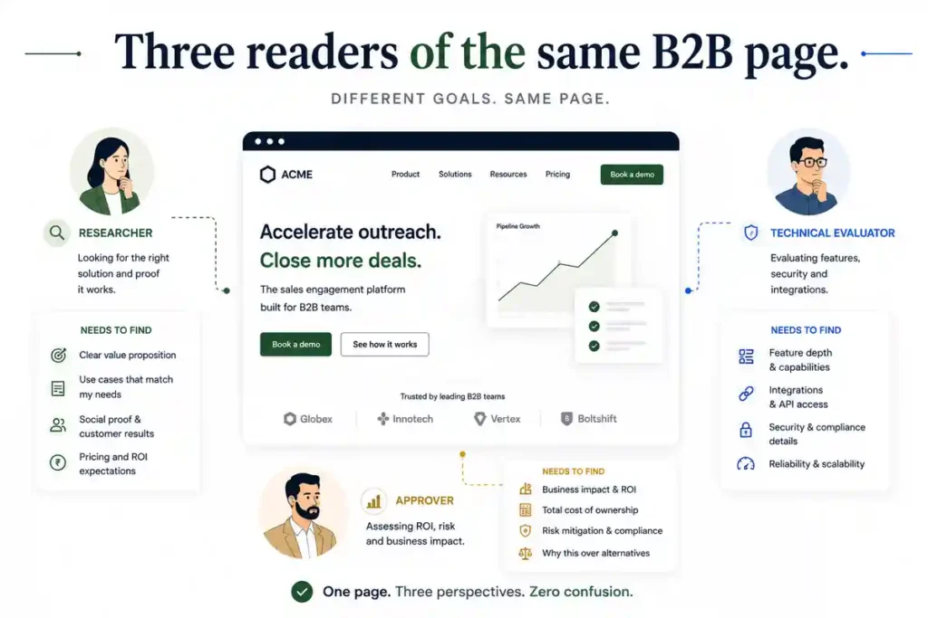
- Different readers need different things — the researcher, the technical evaluator, the approver. Sequence rather than cram.
- Anything time-limited breaks on forwarding. Countdown timers and expiring offers fail the second reader by design.
- B2B traffic volumes make A/B testing largely unavailable, which changes the method rather than the goal.
What the benchmarks say, and what they are worth
Readers ask this first, so it is worth answering directly.
Reported guidance puts a well-performing B2B landing page between 2% and 6% conversion, with strong performers above 10%. Those figures come from agency and vendor content without stated sample sizes, date ranges or definitions of conversion.
They are close to meaningless without three things they never state. Traffic source — branded search converts several times better than cold display. Offer type — a demo request and a whitepaper download are not comparable. Price point — a ₹50,000 product and a ₹50 lakh contract produce entirely different rates.
Use them as a rough sanity check and nothing more. A better test is whether your cost per qualified lead sits below what a customer is worth, covered in working out what a lead is actually worth.
The Second Reader
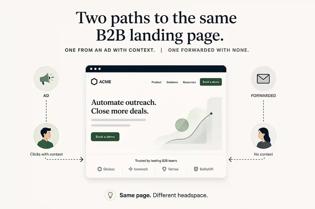
In B2C, one person clicks and decides. In B2B, one person clicks and forwards. The second reader has no ad in their memory, no context for why the link arrived, a different job, and often more authority — and most pages are designed as though they do not exist.
Think about what actually happens after a B2B form is filled, or before it.
Someone in operations clicks your ad, reads the page, and thinks it might be relevant. They do not fill the form. They send the link to their manager with three words: “worth a look?”
The manager opens it on Thursday, from an email, on a phone, with no memory of any advertisement and no idea what problem this was meant to solve. They have twenty seconds and a different set of questions.
That reader decides whether anything happens next.
They arrive without the promise
The most common failure, and the easiest to fix.
A landing page built for ad traffic often assumes the ad did the explaining. The headline continues a thought the second reader never started.
What to do. State the proposition completely on the page, as though nobody had seen anything before. Who it is for, what it does, what problem it removes. The first reader will not mind the repetition; the second reader cannot proceed without it.
A useful test. Open your page in a private window with no referrer. If it does not make sense cold, it fails for a meaningful share of your real audience.
They have a different job
The person who found the page and the people it gets sent to are rarely doing the same work.
The researcher wants to know whether this is broadly relevant and worth anyone’s time.
The technical evaluator wants specifics — integrations, capacity, compliance, whether it handles their edge case.
The approver wants price, risk, and who else has done this.
Cramming all three into the hero produces a page that serves none of them. Sequence instead. Lead with the proposition, then the specifics, then the commercial and trust material. Each reader scrolls to their own section and stops.
Gartner’s research on complex B2B purchases has long put typical buying groups in the range of six to ten people. Not all of them visit your page — but more than one usually does.
They arrive later, and out of context
Anything time-limited breaks. A countdown timer that expired on Tuesday tells Thursday’s reader that this page is stale and possibly that the company is not careful.
Anything conversational breaks. “As discussed” or “following your enquiry” makes no sense to someone who discussed nothing.
Anything session-dependent breaks. Pages that rely on UTM parameters to personalise content show the second reader a default state that may contradict what the first reader described.
They need to be able to send it on
The page will be forwarded again. Design for that.
A clean, readable URL. Long parameter strings look like tracking and get truncated in messages.
No aggressive interruption. An exit popup or a full-screen overlay is a reason not to forward something to a superior.
Something to send with it. A page with a downloadable one-page summary gets forwarded more often, because the sender can attach something rather than only a link.
It should still work in a week. Bookmarkable, stable, and findable again when someone searches your company name after the thread goes quiet.
What this changes about forms
Briefly, because form philosophy is covered elsewhere and the B2B-specific part is narrow.
The person who fills the form may not be the person who evaluated the page. A junior often submits on behalf of a team, which means your form captures the wrong contact and your follow-up reaches someone without authority.
One field fixes most of this. “Who else is involved in this decision?” or “What is your role in this?” — optional, one line, and it tells your sales team whether they are speaking to the buyer or the researcher.
Fewer fields still means more volume and less qualification, the same trade covered in why frictionless forms produce unqualified leads. In B2B the trade is sharper, because a poor lead consumes a long sales conversation rather than a cheap transaction.
And whatever the form produces, speed decides its value. The Harvard Business Review audit of 2,241 companies found an average first response of 42 hours, with 23% never responding at all. On a B2B page that produces a handful of enquiries a month, losing any of them to a slow reply is expensive.
Why testing rarely helps here
B2B landing pages receive a fraction of the traffic consumer pages do, and statistical testing needs volume.
A page on a few hundred visitors a month cannot produce a valid A/B test in any useful timeframe. The full arithmetic — including how many visitors a given baseline actually requires — is in how to find which problem to fix first, and it applies with more force in B2B than anywhere else.
What to do instead. Diagnose rather than experiment. Watch session recordings. Check where people abandon the form. Ask five people who match your buyer to open the page cold and say what they think it does.
And ask your existing customers one question: what nearly stopped you. On a B2B page with low traffic, five honest answers are worth more than any test you could run.
Mistakes that cost real money
Assuming the ad did the explaining. The second reader saw no ad.
Using urgency devices on a page that will be forwarded. They fail by design.
Writing the hero for three audiences at once. It serves none of them.
Sending all B2B ad traffic to a homepage. The context loss compounds — the second reader arrives at a page that never matched the ad in the first place.
Optimising for form fills without knowing who fills them. In B2B the submitter is frequently not the decision-maker.
Running A/B tests on B2B traffic volumes. The results are noise and acting on them is worse than doing nothing.
When the landing page is not the problem
When the offer requires a conversation to understand. Some B2B propositions cannot be explained on a page, and the honest fix is a different first step rather than a better page.
When you are reaching people who are not buying. Around 5% of B2B buyers are in market at any time, per Ehrenberg-Bass research for the LinkedIn B2B Institute. A page cannot convert someone with no current need, and how B2B demand generation actually works covers what to do about the other 95%.
When follow-up is slow. The page produced the enquiry. Everything after that is where B2B deals are usually lost.
When lead quality is the actual complaint. That is a targeting and qualification problem — what makes a B2B lead qualified covers it.
The B2B landing page checklist
☐ Page opened in a private window with no referrer and still makes sense
☐ Proposition stated completely, without assuming the ad was seen
☐ Who it is for named explicitly on the page
☐ Content sequenced for researcher, evaluator and approver in that order
☐ Price or price range present, or its absence decided deliberately
☐ No countdown timers, expiring offers or session-dependent content
☐ No exit popups or full-screen overlays that discourage forwarding
☐ Clean, readable, shareable URL
☐ A downloadable summary available to forward alongside the link
☐ One optional form field capturing the submitter’s role or the decision group
☐ Response time promise stated on the page
☐ Diagnosis planned rather than A/B testing, unless traffic genuinely supports it
Questions we get asked
What is a good B2B landing page conversion rate?
Reported ranges put strong pages between 2% and 6%, with high performers above 10%, though those figures come from vendor content without stated methodology. Judge against your own cost per qualified lead instead.
How many form fields should a B2B landing page have?
Fewer fields produce more submissions and less qualification. The B2B-specific addition is one optional field asking about the person’s role or who else is involved.
Should B2B landing pages be gated?
Gate what has real value and leave the rest open. A gated page that gets forwarded creates friction for the second reader, who may abandon rather than fill a form for content a colleague already read.
Why do B2B landing pages convert lower than B2C?
Longer consideration, higher price, more people involved, and a decision that rarely happens in one session. A lower rate is not necessarily a worse page.
Do B2B landing pages need case studies?
One specific, named outcome does more than a wall of logos — particularly for the approver, who is looking for evidence that somebody comparable has done this already.
How do I know if my page works for the second reader?
Send the URL to someone in your own company who has no involvement in the project and ask what they think it does. The answer arrives in about thirty seconds.
The test to run this afternoon
Open your B2B landing page in a private browser window, with no ad click before it and no UTM parameters attached.
Read it as though a colleague had just sent you the link with no explanation.
Can you tell who it is for, what it does, roughly what it costs, and what happens if you fill in the form? Most B2B pages fail on at least two of those, because they were built for a reader who arrived with context — and the reader who decides usually did not.
If you would like a page reviewed for both readers, and a view on whether your traffic supports testing at all, you can reach out to us on whatsapp at +91 7738844851.
More in Blog
Keep reading
All articles →
Ready to talk about your growth?
Tell us what's stuck and we'll tell you what we'd do first. Free, 30 minutes, no pitch.